As usual, I have a number of different projects on the needles at the same time. Some are easy to continue while chatting, watching tv or riding in the car. Some demand every bit of concentration and good light.
One of the projects is a throw, knitted in strips about forty stitches wide. I'm using cable patterns from a Barbara Walker Treasury.
Assembling a throw like this brings up a number of design decisions. Many of these can be seen in my previous throws.
This one, from 2003, had a colour scheme based on the regency striped wallpaper of the room where it was to be used. It has some reference to a strippy quilt though those were mostly done in red and white. However, I also decided that complex patterns look best set against simpler textures, so I knitted the strips alternating a complex cable with a simpler texture. Assembling the throw was quite challenging as the textural stitches threw the size of the blocks out.
Setting them side by side reveals that there is a subtle contrast there already - it's more muted but it is there.
One of the projects is a throw, knitted in strips about forty stitches wide. I'm using cable patterns from a Barbara Walker Treasury.
Assembling a throw like this brings up a number of design decisions. Many of these can be seen in my previous throws.
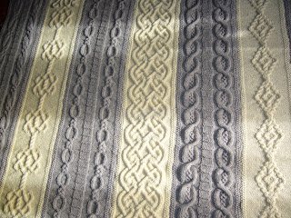
My next throw was intended as an experiment in Celtic and/or Viking knitting as I was visiting Sweden and had been much impressed by Elsebeth Lavold's Viking designs. I certainly knitted some of this on the ferry to Gotland. However, almost everything on this throw is drawn from Alice Starmore jumper patterns Only the animals facing each other is my own idea.
Again, a strip construction, alternating cream and blue, but this time using a plainer, simpler cable and ladder design for the cream strips.
So then, here, Celtic designs on the cream strips and a range of cables on the taupe strips. I had already bought the Barbara Walker Treasury, but Alice Starmore is still in evidence. I gave this to my younger sister for a significant birthday. Putting the more complex patterns on the cream stripes gives a lighter, prettier look to the whole thing. Or perhaps that is just the sunlight?
The question is: Is contrast necessary for a successful effect? Contrast of colour , or of textures?
The strips I have so far on this current project would fit nicely on the Farrow and Ball paint chart. In fact, the grey is Rowan Cork, and the taupe the same as used in the throw above.
I have four strips already, so perhaps I should continue in the same two shades, resisting the urge to insert cream strips between? So, perhaps a wider central panel? I'm wondering how much of each yarn I actually have left and whether this will force the design decision.


.JPG)
1 comment:
I like the more subtle color contrast as it places more emphasis on the cable motifs. The grey and taupe are of similar values so if you added a cream the balance might be thrown off. Perhaps a dark oatmeal if you start running low of the other colors?
Post a Comment